IvanGlobalPrime
Company Representative
- Messages
- 36
The Daily Edge: It’s Brexit Day Amid A Sustained Risk Climate

The Daily Edge is authored by Ivan Delgado, Head of Market Research at Global Prime. The purpose of this content is to provide an assessment of the market conditions. The report takes an in-depth look of market dynamics, factoring in fundamentals, technicals, inter-market, futures and options, in order to determine daily biases and assist one’s decisions on a regular basis. Feel free to follow Ivan on Twitter& Youtube.
The State of Affairs in Financial Markets — Jan 15
As we move into Brexit vote day, the thematic landscape driving FX valuations is in rapid expansion. We are swiftly morphing from a narrowly centric China trade/Fed dovishness macro theme into a much broader plethora of issues.
On top of investors’ minds for the next 24h is the Brexit vote, where all 40 economists polled by Reuters agree on one outcome (UK PM May will lose). It doesn’t mean a defeat is a certainty, as a marginal loss gives UK’s May some leeway to make certain tweak before an ultimate deal goes through.
When all things considered, it does suggest the chances are very slim, perhaps up to 10–15%. May is expected to succumb by a margin of over 60 votes even if that’s just a vague rule of thumb type of number and it may vary quite wildly. The vote is due to take place between 7 and 9 pm UK time on Tuesday.
It seems that even before the vote, and well telegraphed via the bullish price action in the Sterling, markets are looking past the risk event and trying to figure out what options lie ahead in case of an outright defeat. The EU has been very clear that they are not willing to change their hard-line stance on the withdrawal agreement/backstop hashed out last year. The mother of all ironies here is that even if the vote has been delayed, here we are over 1 month later with the exact same conditions faced.
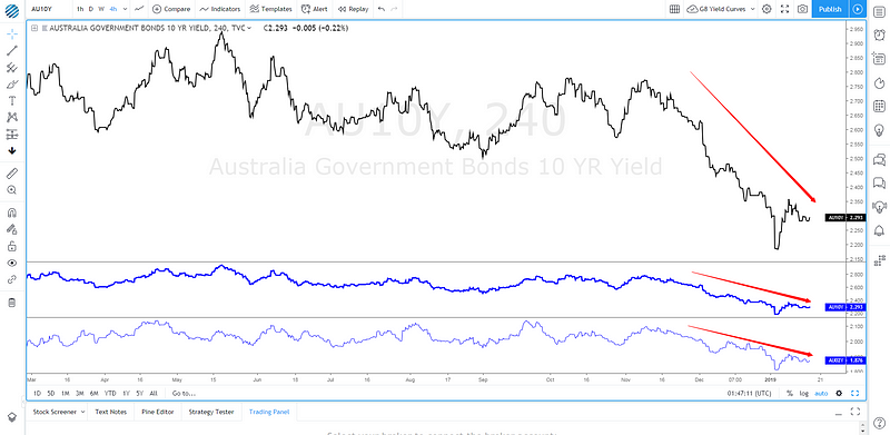
Moving on! The latest Chinese trade figures were a rude awakening for those still sleepy to the fact that the economy engineering half the global growth in the last 10y since the GFC, continues to slow down at an alarming rate. As the chart below exhibits, the data was atrocious, missing expectations by miles.

Source: @Trinhnomics
The deterioration in imports signals a weaker domestic economy while the reduction in exports activity tells us that the ripple effects of a slowdown in China, tighter global monetary conditions, higher domestic spending, are starting to be felt at a time when evidence of a global slow down mounts just as aggregate G4 central bank balance sheets continue to shrink.
And yet the Aussie remains above 72 cents against the US Dollar while way off the post yen flash surge vs JPY. What’s the kicker you may be asking? Even if it sounds counter-intuitive, it’s not all negative. Since the market is an ever-evolving discounting mechanism, the sustainability in risk ever since the start of the year is not only predicated on the Fed pressing the brakes on further rate hikes, but on the anticipation that both the slump in Chinese trade activity and a much stronger Yuan are sufficiently compelling reasons to think that Chinese leaders will be even more desperate to reach a comprehensible trade deal with the US. That is, as long as they can agree on the fine details, including accountability and verifiability on the pact. As a reminder, China’s trade head negotiator is heading to the US on Jan 30th for high-level talks.
Make no mistake, China will do whatever it takes to defend its economy from a financial crisis. We have recently seen evidence of its commitment to underpinning economic conditions by cutting the reserve requirement ratios to banks. It adds to the pyrrhic and rather just symbolic strategic move to double the foreign investor quote into the country to 300bn USD even if it comes at a time of extreme resilience by the RMB. It is precisely the strength of the Chinese Yuan since early in the year that has also exacerbated the weakness seen in the USD via EUR/USD for instance, although no pair expresses this play better than the AUD or NZD vs USD.
Morgan Stanley shares its take on the increase in China’s investment quota: “This is the first expansion since July 2013, when the ceiling was raised to $150bn from $80bn. Bloomberg suggests about US$101bn of the quota is in use by overseas institutions, suggesting that the announcement may have only symbolic relevance for now. However, the resilient RMB, combined with last month’s increase of FX reserves, suggests China may have started benefiting from capital inflows.”
There is an increasing and undeniable correlation between the DXY and the performance of the Chinese Yuan. Anecdotal evidence of the closer economic ties between China and the EU are clearly emerging such as the correlation between the German IFO data series and the Chinese 10-yr yield spread.
Beyond the performance in the Yuan, which is benefiting risk and the Euro as a by-product of USD weakness, the fundamentals out of the Eurozone continue being appalling. The latest piece of evidence emerged from the European industrial production, coming at its lowest in 3y on Monday. Understandably, major banks have been calling for a delay in the ECB rate hike intentions to Q4 2019. Later today, ECB’s President Draghi is due to speak on the Central Bank’s 2017 annual report. A lagging look.
Shifting gears, in the US the big mess the government finds itself in as part of the longest shutdown in history has no end in sight, with US President Trump thought to consider emergency funding. It’s estimated that the pause in the proper running of the country and its public institutions is costing the economy about 1.1b per week and extracting about 0.1% of quarterly annualized GDP every week. According to the Washington Post, a bipartisan Senate group has been formed to reach a solution.
The temporary halt in the running of basic government operations means that US economic data is harder to being collected, which increases the reliance on survey indicators like today’s US NY State Manufacturing index. The data will be interesting to monitor, especially after the sharp decline to 10.9 from a level above 20 in the latest release. US manufacturing data has been faltering as of late. But the real focus as a barometer which can move the needle for US equities this week is the earning seasons, with traditional banks taking center stage. Citi kicked off the season with upbeat results on Monday, allowing the stocks to rise by over 4% despite not enough to lift US indices.
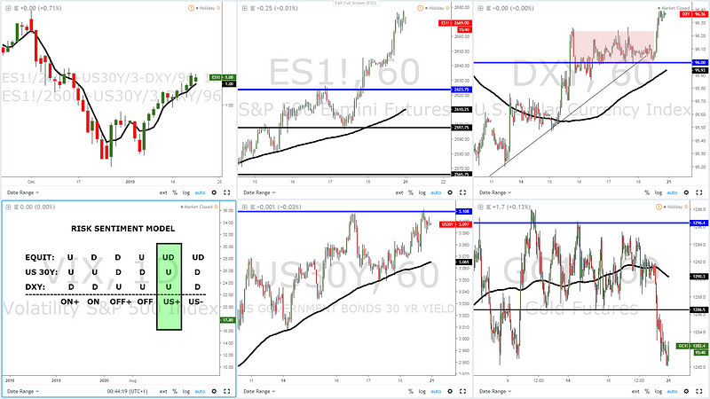
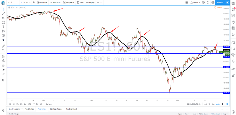
Risk Model: ES Enters Sell-Side Interest Area
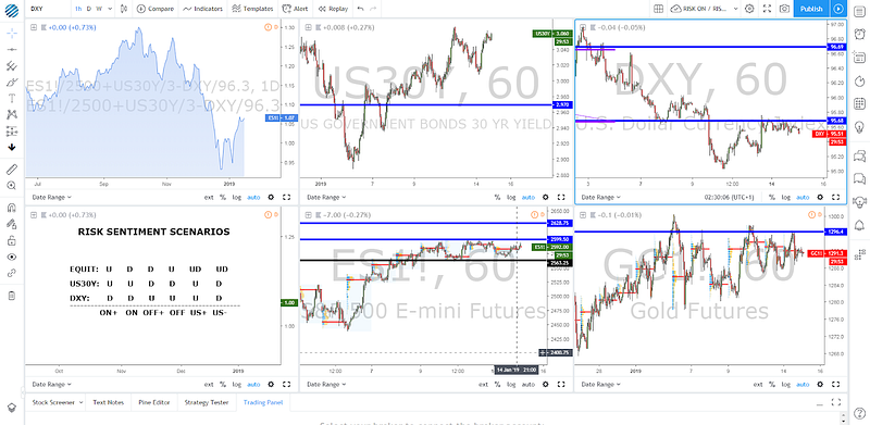
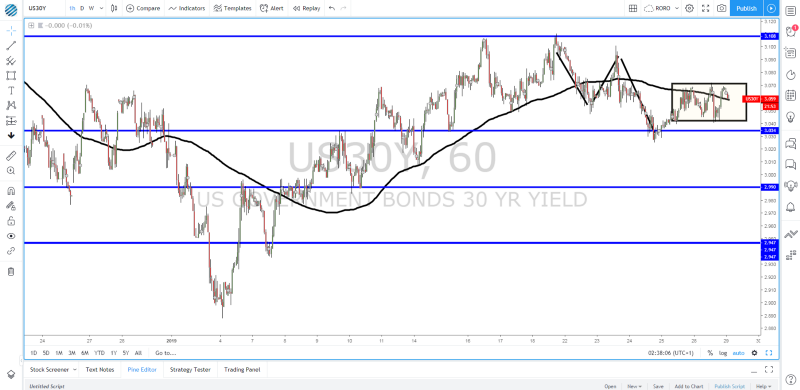
As the area chart in blue above exhibits, the risk remains sustained courtesy of the constructive structure in the US 30-yr bond yields as larger shares of fixed income allocations makes adjustments in line with the recovery in sentiment. The one asset class that really counts as the foreteller of risk going forward is the ES though. The corrective leg has attracted the price at the make-or-break point between 2,600–2,630. It’s a resolution around this area in either direction that is going to stimulate the next risk profile context. For now, the market has entered a consolidation phase between 2,560 and 2,600.
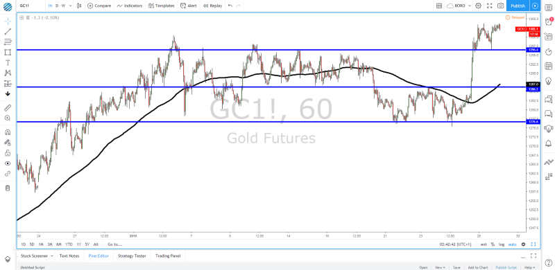
In a similar fashion, gold has found a plateau ahead of $1,300, awaiting further clues out of equities and the DXY performance to a lesser extent, as the asset remains more susceptible to trade on a risk on-off profile. Lastly, as in the case of the S&P 500, the DXY is retesting an absolute critical resistance at 95.70. If you buy into the macro notion that the relief-rally is technical in nature within a broader risk-off context, we have definitely approached levels, especially on the S&P 500, where renewed selling may be seen. However, judging by the structures in the DXY or US 30y bonds, there is significant heavy lifting to be done for the environment to transition into a full-blown risk-off mode. We will need to see a break of 2,560 in the ES, a fall sub 3% in US 30y bonds and ideally the DXY back above 96.00.
Charts Insights: Trading Opportunities
EUR/USD — Buy On Weakness Favored
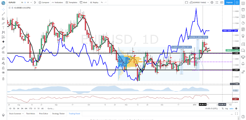
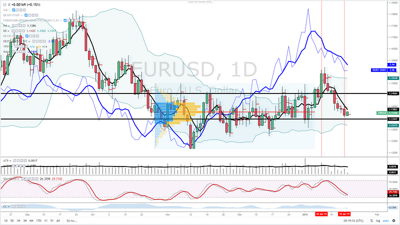
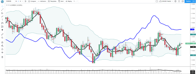
I remain positive on the outlook for the Euro, if only based on the follow through USD weakness one can expect after the resolution lower in the DXY. I was filled long ahead of the 1.15 last week with a stop below the breakout candle from last Wednesday. Remember, even of an increase in the VIX, vol-targeting funds and the accumulation of the EUR-denominated carry trade into US assets may start to feel the pain and further adjustment may be seen, leading to EUR strength. From a structural standpoint, the Euro remains on a second leg up, with the impulsivity of the range breakout exceeding in momentum and magnitude the first upleg instance in mid-Dec. This is a market that remains a buy on weakness judging by the macro and micro divergence on the German-US yield spread. I am not troubled by the vol via the Brexit vote, as the majority of the moves should be GBP-centric according to the implied vol readings I am getting out of the options market.
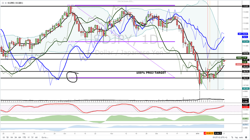
USD/JPY — 100% Proj Target Line In The Sand
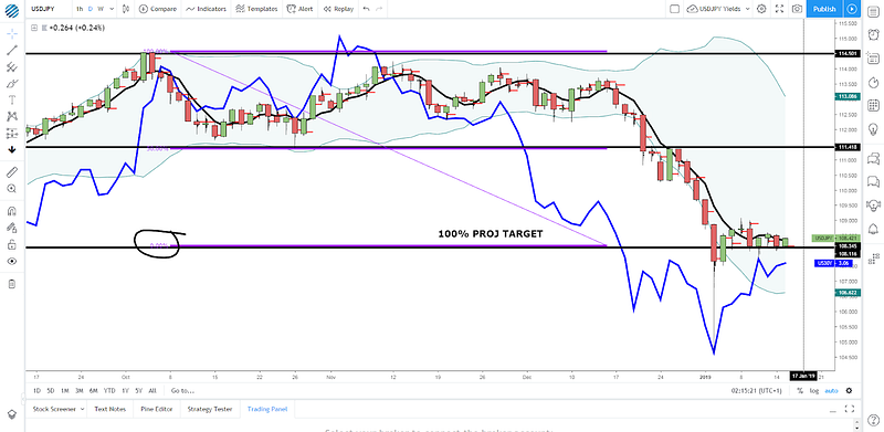
Evidence continues to grow that 108.00 remains a fortress that buyers are committed to defending. Ever since the flash crash episode, we’ve seen constant buying activity lifting the rate away from the 100% projected target level circa the round number. I was triggered long last week and this is a position that I continue to hold onto awaiting for a resolution in either direction. The US 30yr yield spread as a proxy for the USD/JPY (highly correlated to US vs JP yield spread) still shows positive signs. Ever since the bearish run rolled over, 108.00 should represent the lowest risk area for a mean reversal trade. The accumulation of POCs over the last week through 108.00–108.10 is no coincidence.
EUR/CAD — At High-Value Area With Yield Spread Divergence
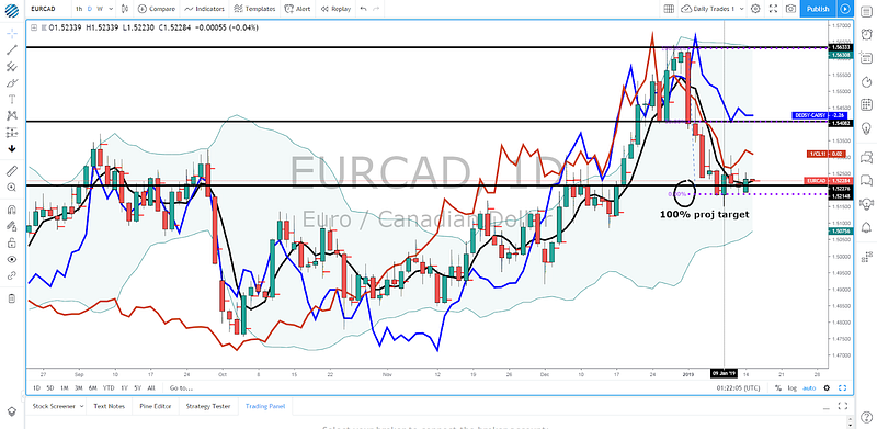
I’ve endorsed playing the long side in the Euro against the US Dollar, but this risk has also been partly diversified via shorting the Canadian Dollar in favor of the shared currency. The macrostructure of higher highs remains supportive of longs despite the early ’19 setback. We only had to wait until the price came to interact with the right levels, which it has since last week. The temporary bottom found around the 1.52 coincides with an old range area and the origin of a strong demand imbalance. The level the pricing deals is tentatively coming to termination as market makers’ bids at the 100% proj target further underpin the pair. Besides, the German vs Canadian bond yield spread shows a major divergence unlike any recent instances in the last few months. Long should be the path of least resistance, considering that on top of all arguments exposed, Oil faces major hurdle at $52.00.
Options — 25 Delta RR & Vols
The two markets that offer the most substantial changes include the British Pound and the S&P 500. Expectations for positive GBP scenarios (2nd Brexit referendum, an extension of article 50, compromise with MPs to pass the bill if marginal defeat) even if UK PM May is initially defeated are being priced into the options market, where the premium to buy Calls has come above the price of the Puts. Extreme caution should also be exercised if engaging in buy-side action in US equities as one component that argues for a negative outlook moving into Tuesday is the increased premium for Puts, where the 25-delta risk reversals have gone back up above -6.00 as impl vol increases.
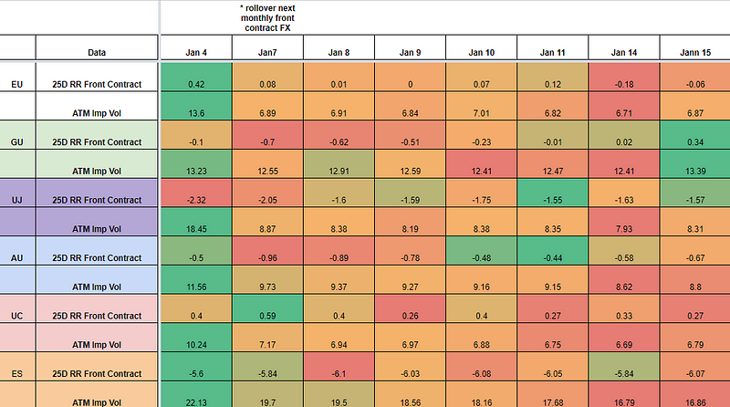
* The 25-delta risk reversal is the result of calculating the vol of the 25 delta call and discount the vol of the 25 delta put. … A positive risk reversal (calls vol greater than puts) implies a ‘positively’ skewed distribution, in other words, an underperformance of longs via spot. The analysis of the 25-delta risk reversals, when combined with different time measures of implied volatility, allows us to factor in more clues about a potential direction. If the day to day pricing of calls — puts increases while there is an anticipation of greater vol, it tends to be a bullish signal to expect higher spot prices.
Source: http://cmegroup.quikstrike.net (The RR settles are ready about 1am UK time).
Options — Ratio Imp/Hist Vol
As seen in the table below, in the next 7 days, the spectrum of G10 currencies face the prospects of trading under a low activity gamma-scalping environment. The high vol regime has increased the appeal to design short vol products for what’s expected to still be expensive vols vs historical standards. However, the risk implies that breakouts can now occur with higher frequency as market makers are forced to bail overly short options exposure.
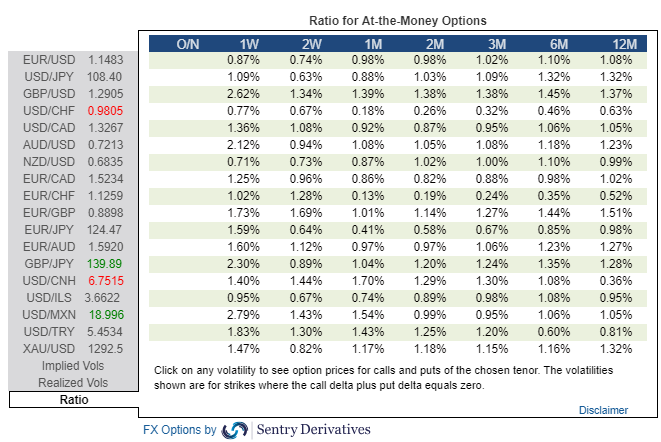
Find below today’s implied / historical vol levels.
* If implied vol is below historical vol, represented by a ratio < 1% in the table above, the market tends to seek equilibrium by being long vega (volatility) via the buying of options. This is when gamma scalping is most present to keep positions delta neutral, which tends to result in markets more trappy/rotational. On the contrary, if implied vol is above historical vol, represented by a ratio > 1%, we are faced with a market that carries more unlimited risks given the increased activity to sell expensive volatility (puts), hence why it tends to result in a more directional market profile when breaks occur. The sellers of puts must hedge their risk by selling on bearish breakouts and vice versa.
Like What You See?
Soon you will be able to subscribe to receive ‘the daily edge’. In the meantime, feel free to follow Ivan on Twitter.
Important Footnotes
The Daily Edge is authored by Ivan Delgado, Head of Market Research at Global Prime. The purpose of this content is to provide an assessment of the market conditions. The report takes an in-depth look of market dynamics, factoring in fundamentals, technicals, inter-market, futures and options, in order to determine daily biases and assist one’s decisions on a regular basis. Feel free to follow Ivan on Twitter& Youtube.
The State of Affairs in Financial Markets — Jan 15
As we move into Brexit vote day, the thematic landscape driving FX valuations is in rapid expansion. We are swiftly morphing from a narrowly centric China trade/Fed dovishness macro theme into a much broader plethora of issues.
On top of investors’ minds for the next 24h is the Brexit vote, where all 40 economists polled by Reuters agree on one outcome (UK PM May will lose). It doesn’t mean a defeat is a certainty, as a marginal loss gives UK’s May some leeway to make certain tweak before an ultimate deal goes through.
When all things considered, it does suggest the chances are very slim, perhaps up to 10–15%. May is expected to succumb by a margin of over 60 votes even if that’s just a vague rule of thumb type of number and it may vary quite wildly. The vote is due to take place between 7 and 9 pm UK time on Tuesday.
It seems that even before the vote, and well telegraphed via the bullish price action in the Sterling, markets are looking past the risk event and trying to figure out what options lie ahead in case of an outright defeat. The EU has been very clear that they are not willing to change their hard-line stance on the withdrawal agreement/backstop hashed out last year. The mother of all ironies here is that even if the vote has been delayed, here we are over 1 month later with the exact same conditions faced.
Moving on! The latest Chinese trade figures were a rude awakening for those still sleepy to the fact that the economy engineering half the global growth in the last 10y since the GFC, continues to slow down at an alarming rate. As the chart below exhibits, the data was atrocious, missing expectations by miles.
Source: @Trinhnomics
The deterioration in imports signals a weaker domestic economy while the reduction in exports activity tells us that the ripple effects of a slowdown in China, tighter global monetary conditions, higher domestic spending, are starting to be felt at a time when evidence of a global slow down mounts just as aggregate G4 central bank balance sheets continue to shrink.
And yet the Aussie remains above 72 cents against the US Dollar while way off the post yen flash surge vs JPY. What’s the kicker you may be asking? Even if it sounds counter-intuitive, it’s not all negative. Since the market is an ever-evolving discounting mechanism, the sustainability in risk ever since the start of the year is not only predicated on the Fed pressing the brakes on further rate hikes, but on the anticipation that both the slump in Chinese trade activity and a much stronger Yuan are sufficiently compelling reasons to think that Chinese leaders will be even more desperate to reach a comprehensible trade deal with the US. That is, as long as they can agree on the fine details, including accountability and verifiability on the pact. As a reminder, China’s trade head negotiator is heading to the US on Jan 30th for high-level talks.
Make no mistake, China will do whatever it takes to defend its economy from a financial crisis. We have recently seen evidence of its commitment to underpinning economic conditions by cutting the reserve requirement ratios to banks. It adds to the pyrrhic and rather just symbolic strategic move to double the foreign investor quote into the country to 300bn USD even if it comes at a time of extreme resilience by the RMB. It is precisely the strength of the Chinese Yuan since early in the year that has also exacerbated the weakness seen in the USD via EUR/USD for instance, although no pair expresses this play better than the AUD or NZD vs USD.
Morgan Stanley shares its take on the increase in China’s investment quota: “This is the first expansion since July 2013, when the ceiling was raised to $150bn from $80bn. Bloomberg suggests about US$101bn of the quota is in use by overseas institutions, suggesting that the announcement may have only symbolic relevance for now. However, the resilient RMB, combined with last month’s increase of FX reserves, suggests China may have started benefiting from capital inflows.”
There is an increasing and undeniable correlation between the DXY and the performance of the Chinese Yuan. Anecdotal evidence of the closer economic ties between China and the EU are clearly emerging such as the correlation between the German IFO data series and the Chinese 10-yr yield spread.
Beyond the performance in the Yuan, which is benefiting risk and the Euro as a by-product of USD weakness, the fundamentals out of the Eurozone continue being appalling. The latest piece of evidence emerged from the European industrial production, coming at its lowest in 3y on Monday. Understandably, major banks have been calling for a delay in the ECB rate hike intentions to Q4 2019. Later today, ECB’s President Draghi is due to speak on the Central Bank’s 2017 annual report. A lagging look.
Shifting gears, in the US the big mess the government finds itself in as part of the longest shutdown in history has no end in sight, with US President Trump thought to consider emergency funding. It’s estimated that the pause in the proper running of the country and its public institutions is costing the economy about 1.1b per week and extracting about 0.1% of quarterly annualized GDP every week. According to the Washington Post, a bipartisan Senate group has been formed to reach a solution.
The temporary halt in the running of basic government operations means that US economic data is harder to being collected, which increases the reliance on survey indicators like today’s US NY State Manufacturing index. The data will be interesting to monitor, especially after the sharp decline to 10.9 from a level above 20 in the latest release. US manufacturing data has been faltering as of late. But the real focus as a barometer which can move the needle for US equities this week is the earning seasons, with traditional banks taking center stage. Citi kicked off the season with upbeat results on Monday, allowing the stocks to rise by over 4% despite not enough to lift US indices.
Risk Model: ES Enters Sell-Side Interest Area
As the area chart in blue above exhibits, the risk remains sustained courtesy of the constructive structure in the US 30-yr bond yields as larger shares of fixed income allocations makes adjustments in line with the recovery in sentiment. The one asset class that really counts as the foreteller of risk going forward is the ES though. The corrective leg has attracted the price at the make-or-break point between 2,600–2,630. It’s a resolution around this area in either direction that is going to stimulate the next risk profile context. For now, the market has entered a consolidation phase between 2,560 and 2,600.
In a similar fashion, gold has found a plateau ahead of $1,300, awaiting further clues out of equities and the DXY performance to a lesser extent, as the asset remains more susceptible to trade on a risk on-off profile. Lastly, as in the case of the S&P 500, the DXY is retesting an absolute critical resistance at 95.70. If you buy into the macro notion that the relief-rally is technical in nature within a broader risk-off context, we have definitely approached levels, especially on the S&P 500, where renewed selling may be seen. However, judging by the structures in the DXY or US 30y bonds, there is significant heavy lifting to be done for the environment to transition into a full-blown risk-off mode. We will need to see a break of 2,560 in the ES, a fall sub 3% in US 30y bonds and ideally the DXY back above 96.00.
Charts Insights: Trading Opportunities
EUR/USD — Buy On Weakness Favored
I remain positive on the outlook for the Euro, if only based on the follow through USD weakness one can expect after the resolution lower in the DXY. I was filled long ahead of the 1.15 last week with a stop below the breakout candle from last Wednesday. Remember, even of an increase in the VIX, vol-targeting funds and the accumulation of the EUR-denominated carry trade into US assets may start to feel the pain and further adjustment may be seen, leading to EUR strength. From a structural standpoint, the Euro remains on a second leg up, with the impulsivity of the range breakout exceeding in momentum and magnitude the first upleg instance in mid-Dec. This is a market that remains a buy on weakness judging by the macro and micro divergence on the German-US yield spread. I am not troubled by the vol via the Brexit vote, as the majority of the moves should be GBP-centric according to the implied vol readings I am getting out of the options market.
USD/JPY — 100% Proj Target Line In The Sand
Evidence continues to grow that 108.00 remains a fortress that buyers are committed to defending. Ever since the flash crash episode, we’ve seen constant buying activity lifting the rate away from the 100% projected target level circa the round number. I was triggered long last week and this is a position that I continue to hold onto awaiting for a resolution in either direction. The US 30yr yield spread as a proxy for the USD/JPY (highly correlated to US vs JP yield spread) still shows positive signs. Ever since the bearish run rolled over, 108.00 should represent the lowest risk area for a mean reversal trade. The accumulation of POCs over the last week through 108.00–108.10 is no coincidence.
EUR/CAD — At High-Value Area With Yield Spread Divergence
I’ve endorsed playing the long side in the Euro against the US Dollar, but this risk has also been partly diversified via shorting the Canadian Dollar in favor of the shared currency. The macrostructure of higher highs remains supportive of longs despite the early ’19 setback. We only had to wait until the price came to interact with the right levels, which it has since last week. The temporary bottom found around the 1.52 coincides with an old range area and the origin of a strong demand imbalance. The level the pricing deals is tentatively coming to termination as market makers’ bids at the 100% proj target further underpin the pair. Besides, the German vs Canadian bond yield spread shows a major divergence unlike any recent instances in the last few months. Long should be the path of least resistance, considering that on top of all arguments exposed, Oil faces major hurdle at $52.00.
Options — 25 Delta RR & Vols
The two markets that offer the most substantial changes include the British Pound and the S&P 500. Expectations for positive GBP scenarios (2nd Brexit referendum, an extension of article 50, compromise with MPs to pass the bill if marginal defeat) even if UK PM May is initially defeated are being priced into the options market, where the premium to buy Calls has come above the price of the Puts. Extreme caution should also be exercised if engaging in buy-side action in US equities as one component that argues for a negative outlook moving into Tuesday is the increased premium for Puts, where the 25-delta risk reversals have gone back up above -6.00 as impl vol increases.
* The 25-delta risk reversal is the result of calculating the vol of the 25 delta call and discount the vol of the 25 delta put. … A positive risk reversal (calls vol greater than puts) implies a ‘positively’ skewed distribution, in other words, an underperformance of longs via spot. The analysis of the 25-delta risk reversals, when combined with different time measures of implied volatility, allows us to factor in more clues about a potential direction. If the day to day pricing of calls — puts increases while there is an anticipation of greater vol, it tends to be a bullish signal to expect higher spot prices.
Source: http://cmegroup.quikstrike.net (The RR settles are ready about 1am UK time).
Options — Ratio Imp/Hist Vol
As seen in the table below, in the next 7 days, the spectrum of G10 currencies face the prospects of trading under a low activity gamma-scalping environment. The high vol regime has increased the appeal to design short vol products for what’s expected to still be expensive vols vs historical standards. However, the risk implies that breakouts can now occur with higher frequency as market makers are forced to bail overly short options exposure.
Find below today’s implied / historical vol levels.
* If implied vol is below historical vol, represented by a ratio < 1% in the table above, the market tends to seek equilibrium by being long vega (volatility) via the buying of options. This is when gamma scalping is most present to keep positions delta neutral, which tends to result in markets more trappy/rotational. On the contrary, if implied vol is above historical vol, represented by a ratio > 1%, we are faced with a market that carries more unlimited risks given the increased activity to sell expensive volatility (puts), hence why it tends to result in a more directional market profile when breaks occur. The sellers of puts must hedge their risk by selling on bearish breakouts and vice versa.
Like What You See?
Soon you will be able to subscribe to receive ‘the daily edge’. In the meantime, feel free to follow Ivan on Twitter.
Important Footnotes
- Risk model: The fact that financial markets have become so intertwined and dynamic makes it essential to stay constantly in tune with market conditions and adapt to new environments. This prop model will assist you to gauge the context that you are trading so that you can significantly reduce the downside risks. To understand the principles applied in the assessment of this model, refer to the tutorial How to Unpack Risk Sentiment Profiles
- Cycles: Markets evolve in cycles followed by a period of distribution and/or accumulation. The weekly cycles are highlighted in red, blue refers to the daily, while the black lines represent the hourly cycles. To understand the principles applied in the assessment of cycles, refer to the tutorial How To Read Market Structures In Forex
- POC: It refers to the point of control. It represents the areas of most interest by trading volume and should act as walls of bids/offers that may result in price reversals. The volume profile analysis tracks trading activity over a specified time period at specified price levels. The study reveals the constant evolution of the market auction process. If you wish to find out more about the importance of the POC, refer to the tutorial How to Read Volume Profile Structures
- Tick Volume: Price updates activity provides great insights into the actual buy or sell-side commitment to be engaged into a specific directional movement. Studies validate that price updates (tick volume) are highly correlated to actual traded volume, with the correlation being very high, when looking at hourly data. If you wish to find out more about the importance tick volume, refer to the tutorial on Why Is Tick Volume Important To Monitor?
- Horizontal Support/Resistance: Unlike levels of dynamic support or resistance or more subjective measurements such as fibonacci retracements, pivot points, trendlines, or other forms of reactive areas, the horizontal lines of support and resistance are universal concepts used by the majority of market participants. It, therefore, makes the areas the most widely followed and relevant to monitor. The Ultimate Guide To Identify Areas Of High Interest In Any Market
- Trendlines: Besides the horizontal lines, trendlines are helpful as a visual representation of the trend. The trendlines are drawn respecting a series of rules that determine the validation of a new cycle being created. Therefore, these trendline drawn in the chart hinge to a certain interpretation of market structures.
- Correlations: Each forex pair has a series of highly correlated assets to assess valuations. This type of study is called inter-market analysis and it involves scoping out anomalies in the ever-evolving global interconnectivity between equities, bonds, currencies, and commodities. If you would like to understand more about this concept, refer to the tutorial How Divergence In Correlated Assets Can Help You Add An Edge.
- Fundamentals: It’s important to highlight that the daily market outlook provided in this report is subject to the impact of the fundamental news. Any unexpected news may cause the price to behave erratically in the short term.
- Projection Targets: The usefulness of the 100% projection resides in the symmetry and harmonic relationships of market cycles. By drawing a 100% projection, you can anticipate the area in the chart where some type of pause and potential reversals in price is likely to occur, due to 1. The side in control of the cycle takes profits 2. Counter-trend positions are added by contrarian players 3. These are price points where limit orders are set by market-makers. You can find out more by reading the tutorial on The Magical 100% Fibonacci Projection