IvanGlobalPrime
Company Representative
- Messages
- 36
Find my latest market thoughts
The Daily Edge: Vol Stimulants Around the Corner Via FOMC & China-US Trade Talks
The Daily Edge is authored by Ivan Delgado, Head of Market Research at Global Prime. The purpose of this content is to provide an assessment of the market conditions. The report takes an in-depth look of market dynamics, factoring in fundamentals, technicals, inter-market, futures and options, in order to determine daily biases and assist one’s decisions on a regular basis. Feel free to follow Ivan on Twitter& Youtube.
State Of Affairs In Financial Markets — Jan 30
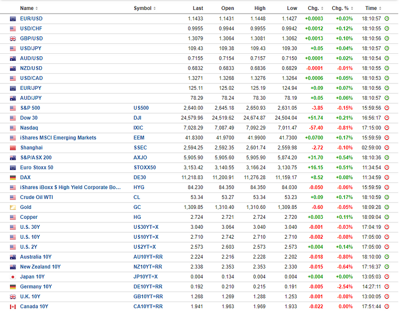
Source: investing.com
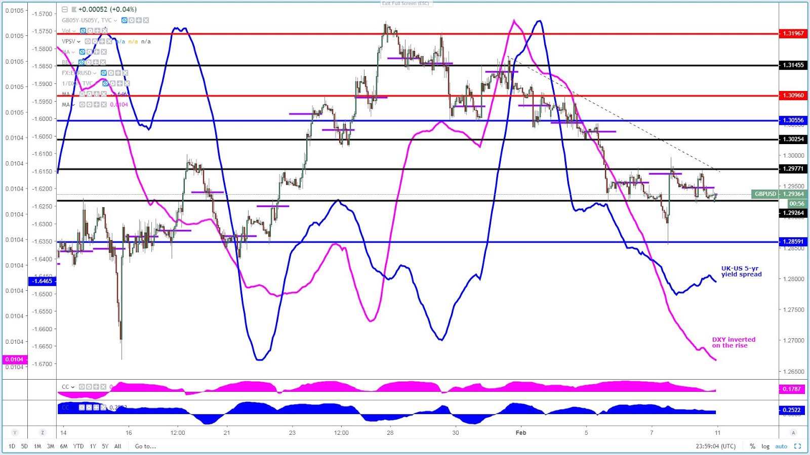
It was a low key affair in the Forex arena ahead of the Federal Reserve monetary policy meeting, where all the attention will orbit around the Central Bank’s position on its balance sheet. But first things first, as the only currency exhibiting signs of life late on the day on Tuesday, courtesy of the Brexit amendments votes in the UK parliament, was the British Pound.
Today’s debate and votes on Brexit by UK MPs was about finding a more consensual way forward while getting a pulse of the desire by the government to avoid a ‘No-Deal’ Brexit. After all said and done, it very much played out as one would have expected, with amendments related to creating a safety net that the UK won’t leave the EU without a deal finding enough approval. However, judging by the late sell-off in the Pound, the narrative in today’s GBP playbook was all about getting the maximum guarantee that the UK will avoid a hard Brexit, so the fact that votes by MPs Cooper-Boles on blocking a hard Brexit failed, it’s a testament that any re-emergence of the dreaded word ‘hard Brexit’ as even a remote possibility spooks markets and the Pound, as a result, expressed those fears. Throwing cold water, the EU has reiterated that the withdrawal deal and the Irish backstop won’t be re-negotiated.
Find below a table put together by Morgan Stanley listing the different proposers during Tuesday’s amendment votes alongside a summary of what went for a vote. I also include a timeline.
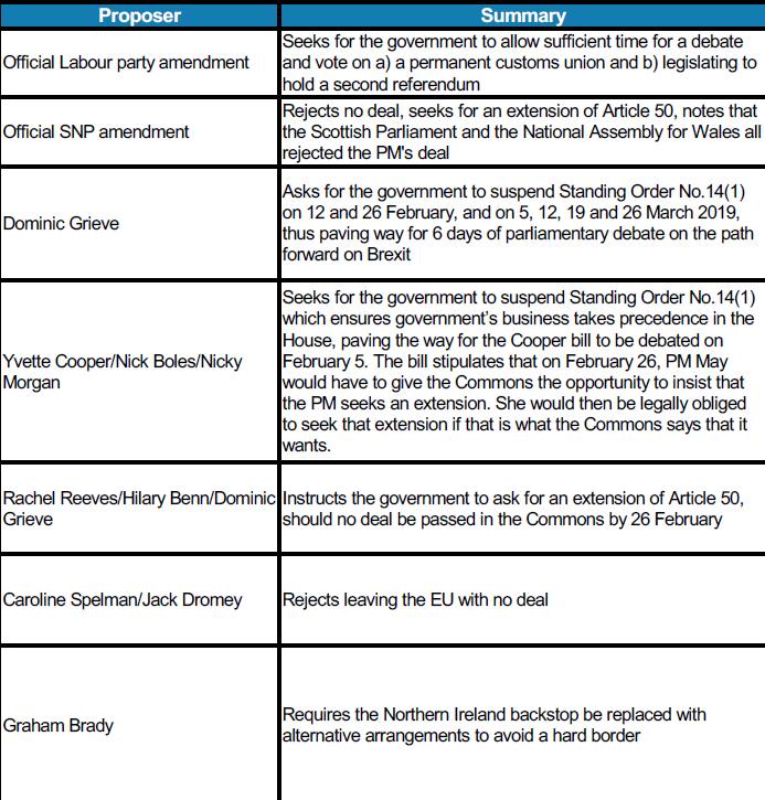
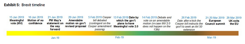
Source: Morgan Stanley
Let’s now shift gears away from Brexit, as there is a significant number of moving pieces to contend with in the next 24h-48h. On top of everyone’s mind is the FOMC meeting later today. Ever since last week, there have been credible chatting, as the story was reported by the WSJ, that Fed officials may weigh an earlier-than-expected end to its bond portfolio runoff. It’s blatantly obvious that Central Banks, with the Fed very much at the epicenter, have become the ultimate providers of market liquidity to keep disguising the structural and cyclical negatives of an aiding global economy.
That’s why in today’s FOMC, most of the attention will be centered around the narrative towards forwarding tweaks to the quantitative tightening process (QT) and a possible normalization of the Fed’s balance sheet to keep sustaining markets. Fed’s Chairman Jerome Powell and the rest of Central Bankers for this matter, at the end of the day, perform a stability-seeking role, and that’s why the balance sheet and the excess liquidity that it provides to the system is the absolute number 1 topic that the narrative has evolved into.
Central Banks try to convey the idea that their policies must act in line with a mandate of maximal employment and regular inflation, not too high nor too low, but ultimately, if the financial conditions manifest trouble in the economy as seen through the tightening of financial conditions in Q4 2018 as the selling tsunami overwhelmed equity traders, that when you simply must listen to the market and recalibrate your policies in accordance to provide a safety net. That’s where the Fed stance at the moment, suggesting that a lifeline in the form of a re-adjustment in its balance sheet to keep higher levels of liquidity into the system is a real possibility, that narrative will be the fuel for markets to seek the new points of equilibrium on Wednesday.
The art of communication in the domain of Central Banking involves the right precision and calculus in timing your intentions (the ‘when’), properly working out the forms in how you are going to project that message (the ‘how’), the content of the message itself (the ‘what) and whether or not it exists enough evidence to take a certain course of action (the ‘why’).
Ever since Fed’s Powell caved in to the desires of the market (revert its QT) by suggesting the Fed balance sheet shrink is no longer in ‘auto-pilot’, what became known as the Fed Put, the equity market has had a stellar 10+% run-up, which tells me that the pre-conditions for the Fed to flex its muscle by stepping up its rhetoric on backtracking its QT program are still not there.
The governing board at the Fed is surely going to figure out the best course of action should the proverbial hit the fan again, but the aggressive recovery in equities simply makes the ‘when’ and ‘why’ boxes of the semantic game not yet justifiable to be ticked. The Fed is not at a stage in which it needs to convey a message of readiness to end the balance sheet reduction should all the pre-conditions be present. That’s what the Central Bank will aim to achieve by massaging at the best of its abilities the ‘what’ and ‘how’, but the reduction of tail risks in equities gives them some breather on ‘when’ and ‘why’.
However, what doesn’t provide much space to maneuver is the potential weakening trends not only emerging off a global slowdown but also from the longest government shutdown on record, that’s why no matter the talk around the balance sheet, a very cautious tone is still warranted. Another reason for the Fed not to sound too aggressively committal on its balance sheet normalization narrative is what Morgan Stanley Strategy team notes.
“There is for the Treasury’s cash balance to be depleted in March, should the debt ceiling waiver fail to be extended, which serves as a form of “mini QE” by raising excess reserves and liquidity in the system, in turn supporting financial markets and keeping volatility suppressed, leading to a USD-negative catalyst by rendering higher-yielding currencies elsewhere more attractive.”
But the FOMC won’t be the only volatility stimulant as the market must also pay extremely close attention to what’s arguably been the most constant and regular story playing out in markets since the turn of the year. Yes, the Fed’s Put did its wonders to carve out a bottom in stocks, but in the background, the root cause of the Fed easing its stance comes as a response of falling equities, which was also influenced by concerns over global growth, mainly emanating from China. At the risk of sounding like a broken record, the perfect analogy here is that if China sneezes the rest of the world catches a cold. You cannot expect that the country engineering, through over-leverage, half the global growth in the last decade to slow down and the RoW (rest of the world) stay immune. There complex webs built over the years with China through supply chains, investment in properties, trading activity are way too intertwined with each other. But here is the problem, China as a patient is suffering a cold itself, with the policies of its own making spreading across the broader economy…
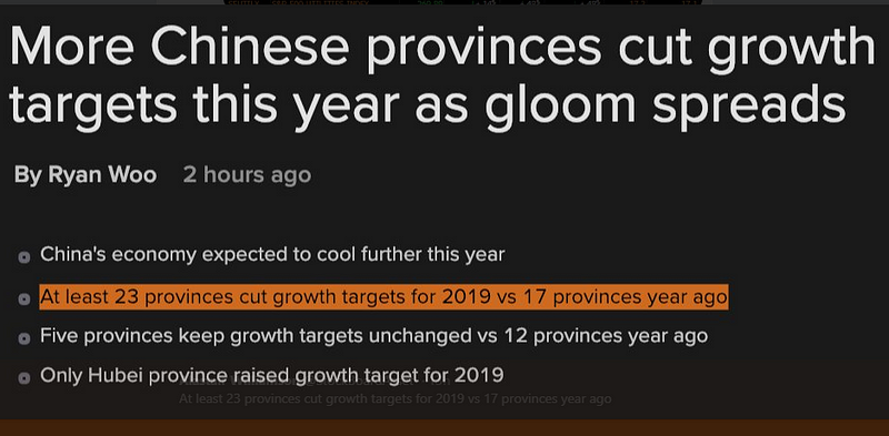
Source: Bloomberg
and since these symptoms are going to be magnified elsewhere, there is little wonder that one of the key narratives for 2019 is the topic of a “global slowdown”, which implies a reversion back to easing policies. The PBOC appears to have truly abandoned any vague commitment towards de-leveraging the economy (just check the chart below), the ECB has vowed to make further use of its monetary toolkit if conditions deteriorate further, the Fed is on a collision course with a wall of reality called ‘takes the foot off the QT pedal or you’ll be punished’, while the rest of countries will play along.
The above paragraph was just a primer aimed to set you up with the right levels of attention about what I am about to say. The market and risk assets wouldn’t have been supported the way they have unless the market thought there is a silver lining in the China-US trade talks. As a Chinese delegation lands in Washington to discuss the most pressing issues leading to the present stand-off (enforcement of commitment, IP thefts, access to Chinese markets, reduction of the trade deficit), one cannot help but suspect that the stage has not been set up for the best possible start.
Just read some of the headlines from the last 24h carried by mainstream media the likes of the WSJ. It’s in both countries interest to reach an agreement to stabilize markets, but again, this is as pure a game of chicken as it gets, and no country seems to be willing to give too many concessions that may pose a risk to their strategic outlook. In the case of Trump, he must get away with the best possible deal to re-inflate its approvals (he is a man willing to prolong the agony as seen via shutdown), while the Chinese do feel areas such as IP, access to local markets, as sacred areas that must be very carefully discussed not to disrupt its 2025 Made in China strategy.
Besides, one of the reasons that it’s going to make it even more difficult to reach a deal, at least won’t happen overnight, is the demand for extradition and the charges by US federal prosecutors after Chinese telecommunications giant Huawei and its chief financial officer Meng Wanzhou for financial fraud in a sweeping 13-count indictment. It includes charges from stealing trade secrets from an American competitor to defrauding banks to evade sanctions on Iran, among others, which without a doubt is throwing a wrench into trade talks. The Ministries of Industry, IT or the Foreign, have already manifested their disagreement, stating that the charges are ‘unfair and immoral’.
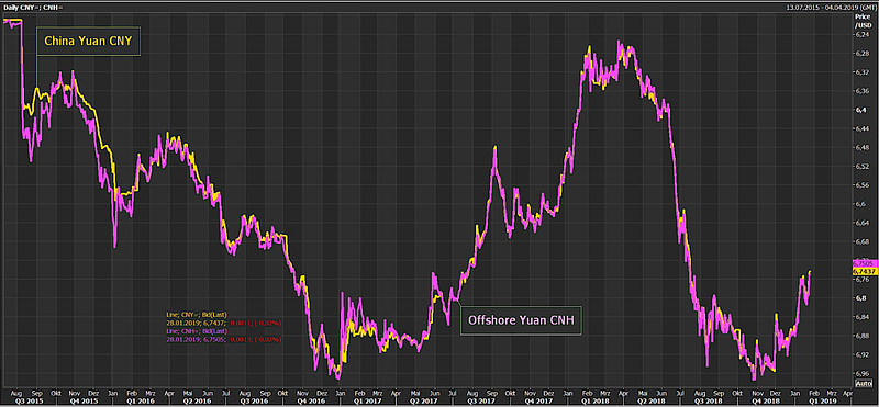
There are just way too many moving pieces. For instance, China has been trying to play along by creating a conducive and positive mood ahead of the meeting judging by the Yuan appreciation.
source: @Schuldensuehner
It won’t be an easy path before a deal is reached. Semantics will play a key role, and I can expect that while grave discrepancies will come afloat, the talk to the media may remain constructive. This is high-level prime time talks folks, so expect China to try its best to provide concessions and a clearer timeline. We should see if that moves the needle because they both badly need it, especially the Chinese side.
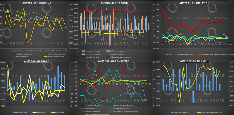
Now, I want to go back to the influence that China has been playing over the rest of the world, as no country has been able to ripe the benefits as much as Australia did. If you think about it, the unequivocal underlying reason that the economy in Australia has thrived the way it has since the GFC, even without resorting to any type of QE experiment, is the proximity to China.
But as China started to shift its focus from an industrial-heavy nation into a consumer-driven, which has eventually led to a major slowdown (car sales on a slump, consumption falling off a cliff, etc.), no country is going to feel the effects as much as Australia. With large shares of the country’s wealth tied up to a falling property market, the question was always going to be. Will the domino effect keeps its course from a slower China -> lower house prices -> feedback into the real economy.
After Tuesday’s dreadful NAB’s Australian business conditions, to me, there is no doubt that the economy is teetering on the brink of a major awakening, one in which the first to blink and possibly act is the RBA by cutting interest rates. That’s what bond traders have been telegraphing anyway. Be therefore prepared for the Central Bank to acknowledge the falls seen in auto sales, credit growth, house prices as soon as next week, when policymakers return from its summer mini-sabbatical.
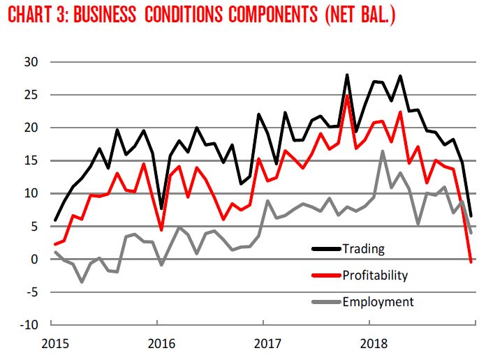
Source: NAB
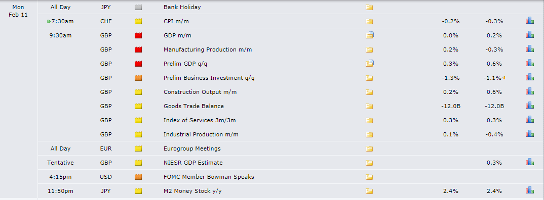
Risk Events/ Economic Heatmap
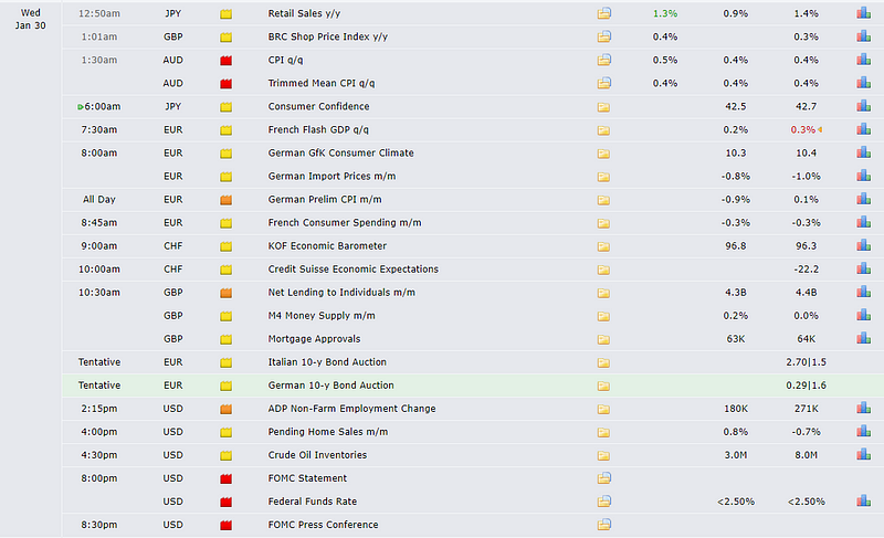
source: Forexfactory
Access our heatmap tables organized by countries in the following link.
Charts Insights: What Charts To Pay Attention To?
USD/JPY — Short Setup Ahead of the FOMC
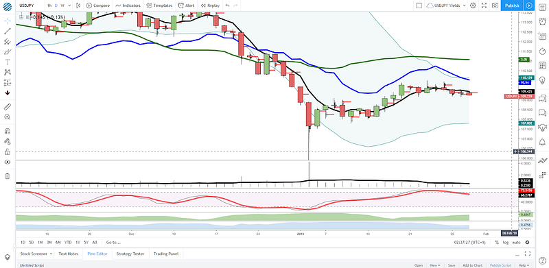
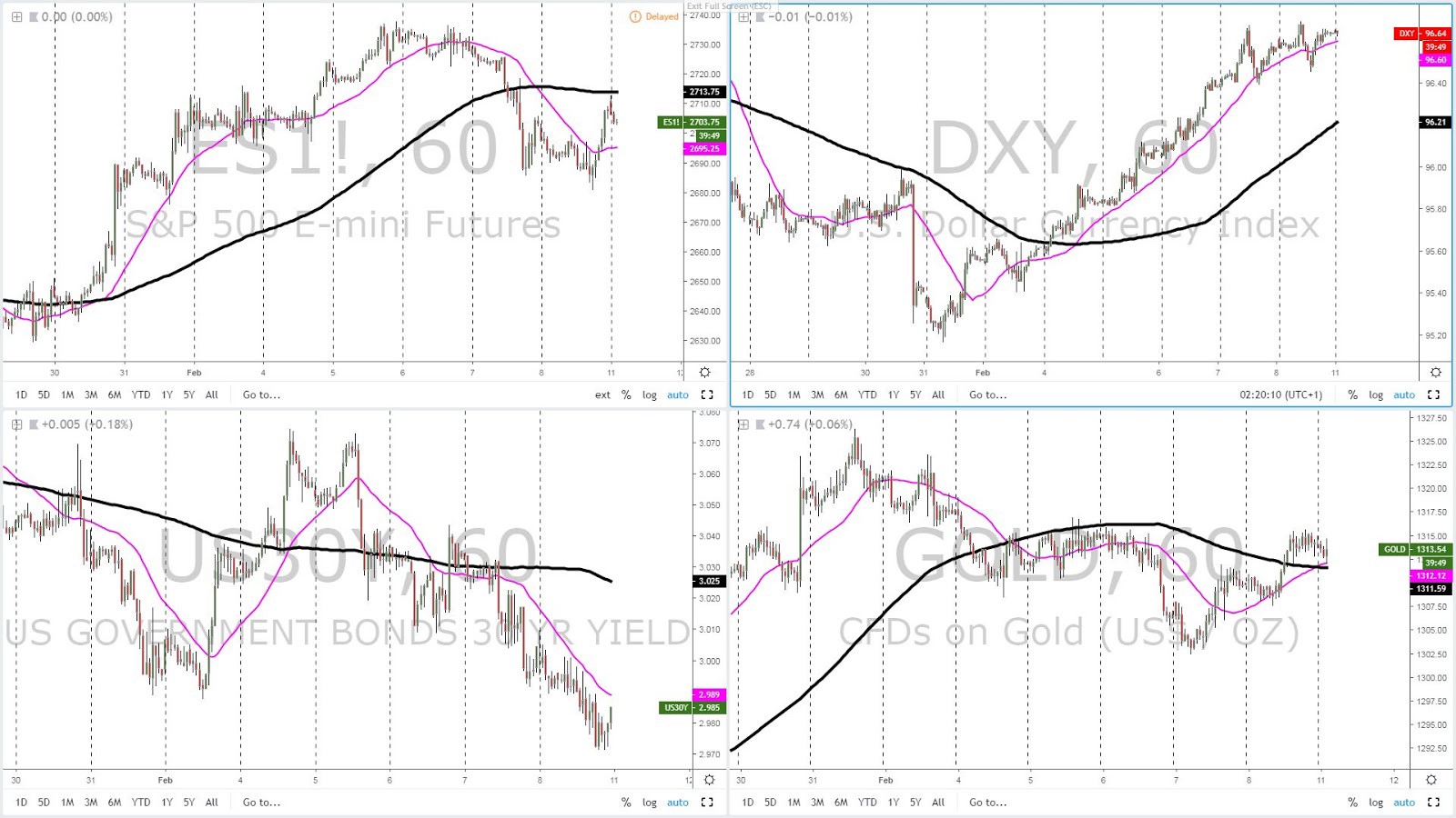
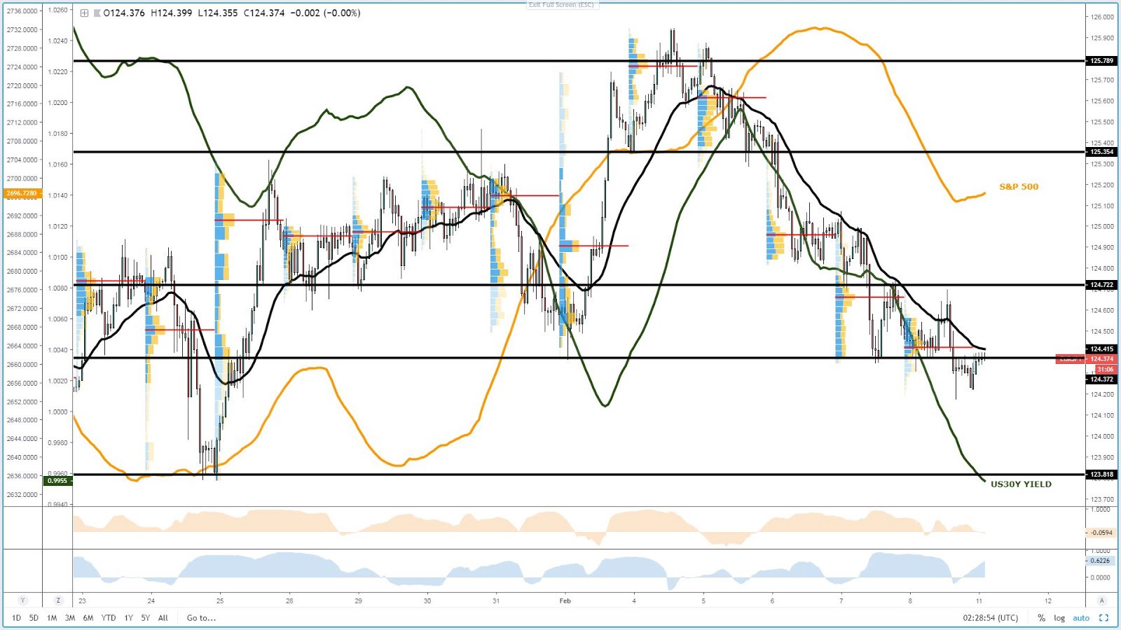
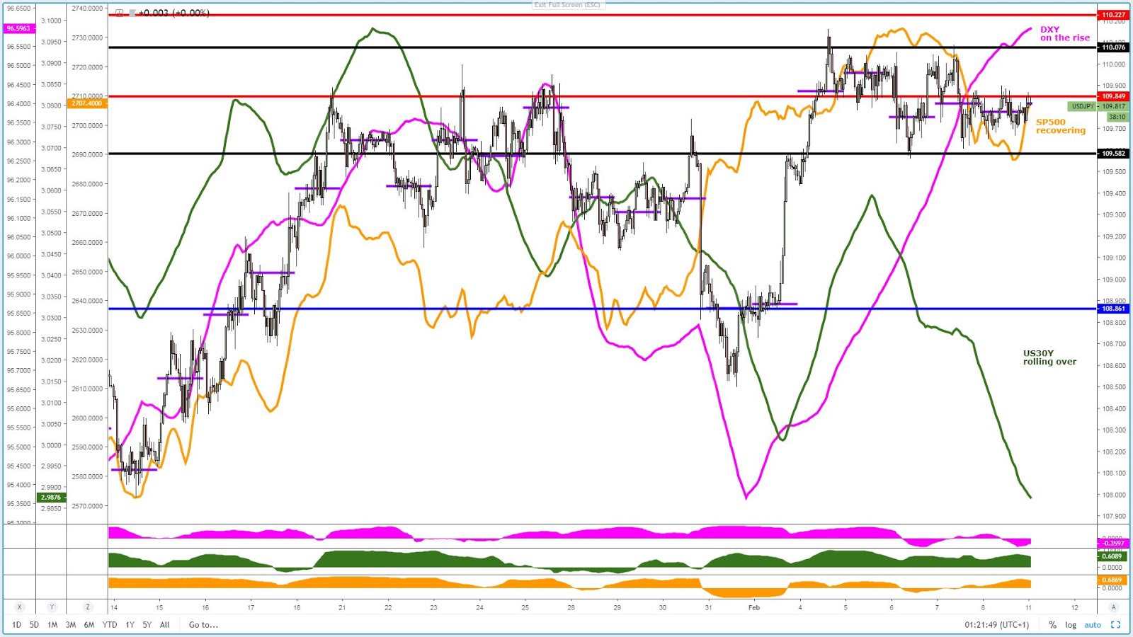
If there is a market where the risk reward ahead of the FOMC appears to be skewed towards the downside judging by the convergence of correlations, that’s the USD/JPY. After a 1-week long consolidation with 110.00 casting a shadow for buyers just overhead, the rolling over of the US 30-year bond yield alongside the pronounced weakness in the DXY is the perfect receipt to see a sell-side campaign in the pair re-emerging. However, with the FOMC just around the corner, you don’t want to keep your exposure too heavily as the initial withdrawal of liquidity will make prices whipsaw very erratically. Look to get involved once the dust settles and the market, through price action, shows its hand, but be aware that the backdrop is a negative one for the pair heading into FOMC day.
AUD/USD — At A Premium Based On Potential Central Bank Divergence
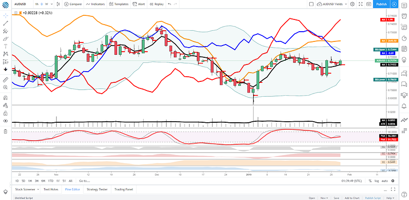
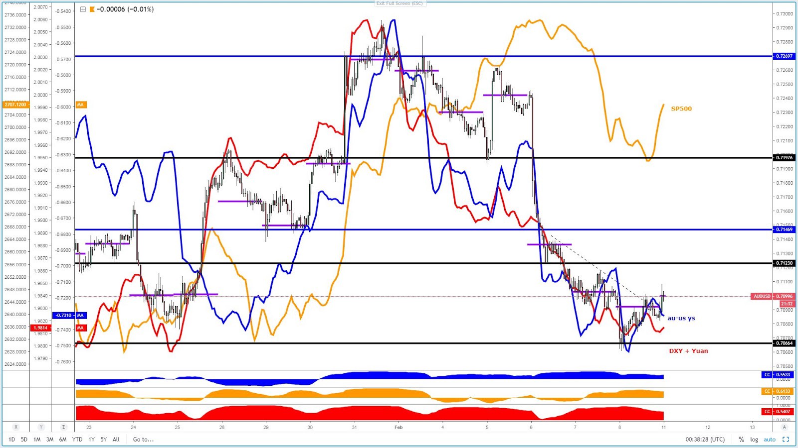
If it wasn’t for the lingering positive effects that the US-China trade talk negotiations have engineered in the price of beta currencies the likes of the Aussie, which also finds its backing from broad-based USD weakness, one would think the pricing of the pair is at an attractive level to short. Especially if you buy into the idea that the RBA may revise down its outlook for the economy and eventually cut interest rates to lessen the debt burden by household and stimulate consumption. However, the price action and correlated instruments (SP500, Yuan, DXY) all show this is not the time to be a hero by shorting the Aussie. Re-assessing the picture post FOMC will be a positive exercise of patience. Besides, AUD outlook has been clouded by its deteriorating fundamentals, while the USD is one of the weakest currencies in the last week, hence the combination of currencies does not seem to be the best to exploit market movements in the next 24h. Throw into the mix the unpredictability of the US-China trade talks this week, and I’d say this is a high-risk pair to get involved this week.
GOLD — Benefits From USD Weakness Like No Other
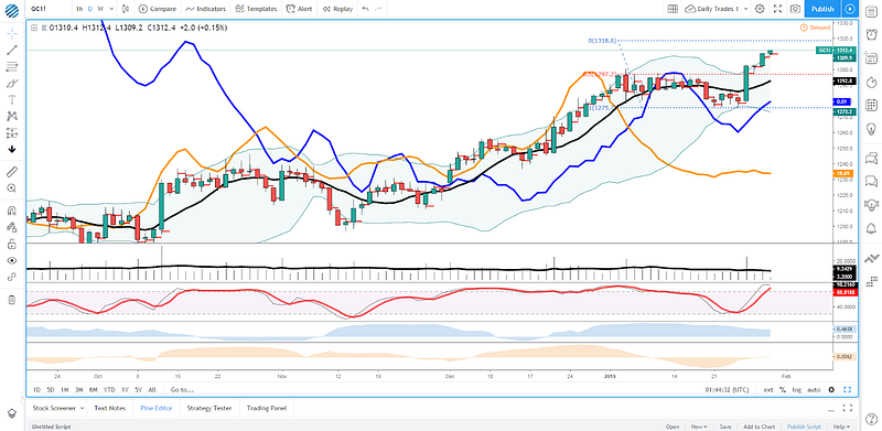
If one asset class manifests the recent debilitated state in the US Dollar, look no further, that’s gold. In a world where each and every currency carries to a lesser or greater extent negative fundamentals, there appears to be a consensus among the investing community that the precious metal is the safest house in a troubled world with ever increasing tail risks of either further selling in equities or the reversion back to easing policies by Central Banks down the road. Gold has been performing admirably well in times of risk aversion while the falls in times of USD strength and/or risk appetite have been extremely well contained. That should tell us a lot about demand and supply.
Options — 25 Delta RR & Vols
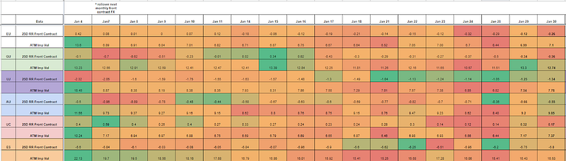
* The 25-delta risk reversal is the result of calculating the vol of the 25 delta call and discount the vol of the 25 delta put. … A positive risk reversal (calls vol greater than puts) implies a ‘positively’ skewed distribution, in other words, an underperformance of longs via spot. The analysis of the 25-delta risk reversals, when combined with different time measures of implied volatility, allows us to factor in more clues about a potential direction. If the day to day pricing of calls — puts increases while there is an anticipation of greater vol, it tends to be a bullish signal to expect higher spot prices.
Source: http://cmegroup.quikstrike.net (The RR settles are ready about 1am UK time).Options — Ratio Imp/Hist Vol
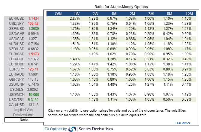
Find below today’s implied / historical vol levels.
* If implied vol is below historical vol, represented by a ratio < 1% in the table above, the market tends to seek equilibrium by being long vega (volatility) via the buying of options. This is when gamma scalping is most present to keep positions delta neutral, which tends to result in markets more trappy/rotational. On the contrary, if implied vol is above historical vol, represented by a ratio > 1%, we are faced with a market that carries more unlimited risks given the increased activity to sell expensive volatility (puts), hence why it tends to result in a more directional market profile when breaks occur. The sellers of puts must hedge their risk by selling on bearish breakouts and vice versa.Like What You See?
Soon you will be able to subscribe to receive ‘the daily edge’. In the meantime, feel free to follow Ivan on Twitter.
Important Footnotes
The Daily Edge: Vol Stimulants Around the Corner Via FOMC & China-US Trade Talks
The Daily Edge is authored by Ivan Delgado, Head of Market Research at Global Prime. The purpose of this content is to provide an assessment of the market conditions. The report takes an in-depth look of market dynamics, factoring in fundamentals, technicals, inter-market, futures and options, in order to determine daily biases and assist one’s decisions on a regular basis. Feel free to follow Ivan on Twitter& Youtube.
State Of Affairs In Financial Markets — Jan 30
Source: investing.com
It was a low key affair in the Forex arena ahead of the Federal Reserve monetary policy meeting, where all the attention will orbit around the Central Bank’s position on its balance sheet. But first things first, as the only currency exhibiting signs of life late on the day on Tuesday, courtesy of the Brexit amendments votes in the UK parliament, was the British Pound.
Today’s debate and votes on Brexit by UK MPs was about finding a more consensual way forward while getting a pulse of the desire by the government to avoid a ‘No-Deal’ Brexit. After all said and done, it very much played out as one would have expected, with amendments related to creating a safety net that the UK won’t leave the EU without a deal finding enough approval. However, judging by the late sell-off in the Pound, the narrative in today’s GBP playbook was all about getting the maximum guarantee that the UK will avoid a hard Brexit, so the fact that votes by MPs Cooper-Boles on blocking a hard Brexit failed, it’s a testament that any re-emergence of the dreaded word ‘hard Brexit’ as even a remote possibility spooks markets and the Pound, as a result, expressed those fears. Throwing cold water, the EU has reiterated that the withdrawal deal and the Irish backstop won’t be re-negotiated.
Find below a table put together by Morgan Stanley listing the different proposers during Tuesday’s amendment votes alongside a summary of what went for a vote. I also include a timeline.
Source: Morgan Stanley
Let’s now shift gears away from Brexit, as there is a significant number of moving pieces to contend with in the next 24h-48h. On top of everyone’s mind is the FOMC meeting later today. Ever since last week, there have been credible chatting, as the story was reported by the WSJ, that Fed officials may weigh an earlier-than-expected end to its bond portfolio runoff. It’s blatantly obvious that Central Banks, with the Fed very much at the epicenter, have become the ultimate providers of market liquidity to keep disguising the structural and cyclical negatives of an aiding global economy.
That’s why in today’s FOMC, most of the attention will be centered around the narrative towards forwarding tweaks to the quantitative tightening process (QT) and a possible normalization of the Fed’s balance sheet to keep sustaining markets. Fed’s Chairman Jerome Powell and the rest of Central Bankers for this matter, at the end of the day, perform a stability-seeking role, and that’s why the balance sheet and the excess liquidity that it provides to the system is the absolute number 1 topic that the narrative has evolved into.
Central Banks try to convey the idea that their policies must act in line with a mandate of maximal employment and regular inflation, not too high nor too low, but ultimately, if the financial conditions manifest trouble in the economy as seen through the tightening of financial conditions in Q4 2018 as the selling tsunami overwhelmed equity traders, that when you simply must listen to the market and recalibrate your policies in accordance to provide a safety net. That’s where the Fed stance at the moment, suggesting that a lifeline in the form of a re-adjustment in its balance sheet to keep higher levels of liquidity into the system is a real possibility, that narrative will be the fuel for markets to seek the new points of equilibrium on Wednesday.
The art of communication in the domain of Central Banking involves the right precision and calculus in timing your intentions (the ‘when’), properly working out the forms in how you are going to project that message (the ‘how’), the content of the message itself (the ‘what) and whether or not it exists enough evidence to take a certain course of action (the ‘why’).
Ever since Fed’s Powell caved in to the desires of the market (revert its QT) by suggesting the Fed balance sheet shrink is no longer in ‘auto-pilot’, what became known as the Fed Put, the equity market has had a stellar 10+% run-up, which tells me that the pre-conditions for the Fed to flex its muscle by stepping up its rhetoric on backtracking its QT program are still not there.
The governing board at the Fed is surely going to figure out the best course of action should the proverbial hit the fan again, but the aggressive recovery in equities simply makes the ‘when’ and ‘why’ boxes of the semantic game not yet justifiable to be ticked. The Fed is not at a stage in which it needs to convey a message of readiness to end the balance sheet reduction should all the pre-conditions be present. That’s what the Central Bank will aim to achieve by massaging at the best of its abilities the ‘what’ and ‘how’, but the reduction of tail risks in equities gives them some breather on ‘when’ and ‘why’.
However, what doesn’t provide much space to maneuver is the potential weakening trends not only emerging off a global slowdown but also from the longest government shutdown on record, that’s why no matter the talk around the balance sheet, a very cautious tone is still warranted. Another reason for the Fed not to sound too aggressively committal on its balance sheet normalization narrative is what Morgan Stanley Strategy team notes.
“There is for the Treasury’s cash balance to be depleted in March, should the debt ceiling waiver fail to be extended, which serves as a form of “mini QE” by raising excess reserves and liquidity in the system, in turn supporting financial markets and keeping volatility suppressed, leading to a USD-negative catalyst by rendering higher-yielding currencies elsewhere more attractive.”
But the FOMC won’t be the only volatility stimulant as the market must also pay extremely close attention to what’s arguably been the most constant and regular story playing out in markets since the turn of the year. Yes, the Fed’s Put did its wonders to carve out a bottom in stocks, but in the background, the root cause of the Fed easing its stance comes as a response of falling equities, which was also influenced by concerns over global growth, mainly emanating from China. At the risk of sounding like a broken record, the perfect analogy here is that if China sneezes the rest of the world catches a cold. You cannot expect that the country engineering, through over-leverage, half the global growth in the last decade to slow down and the RoW (rest of the world) stay immune. There complex webs built over the years with China through supply chains, investment in properties, trading activity are way too intertwined with each other. But here is the problem, China as a patient is suffering a cold itself, with the policies of its own making spreading across the broader economy…
Source: Bloomberg
and since these symptoms are going to be magnified elsewhere, there is little wonder that one of the key narratives for 2019 is the topic of a “global slowdown”, which implies a reversion back to easing policies. The PBOC appears to have truly abandoned any vague commitment towards de-leveraging the economy (just check the chart below), the ECB has vowed to make further use of its monetary toolkit if conditions deteriorate further, the Fed is on a collision course with a wall of reality called ‘takes the foot off the QT pedal or you’ll be punished’, while the rest of countries will play along.
The above paragraph was just a primer aimed to set you up with the right levels of attention about what I am about to say. The market and risk assets wouldn’t have been supported the way they have unless the market thought there is a silver lining in the China-US trade talks. As a Chinese delegation lands in Washington to discuss the most pressing issues leading to the present stand-off (enforcement of commitment, IP thefts, access to Chinese markets, reduction of the trade deficit), one cannot help but suspect that the stage has not been set up for the best possible start.
Just read some of the headlines from the last 24h carried by mainstream media the likes of the WSJ. It’s in both countries interest to reach an agreement to stabilize markets, but again, this is as pure a game of chicken as it gets, and no country seems to be willing to give too many concessions that may pose a risk to their strategic outlook. In the case of Trump, he must get away with the best possible deal to re-inflate its approvals (he is a man willing to prolong the agony as seen via shutdown), while the Chinese do feel areas such as IP, access to local markets, as sacred areas that must be very carefully discussed not to disrupt its 2025 Made in China strategy.
Besides, one of the reasons that it’s going to make it even more difficult to reach a deal, at least won’t happen overnight, is the demand for extradition and the charges by US federal prosecutors after Chinese telecommunications giant Huawei and its chief financial officer Meng Wanzhou for financial fraud in a sweeping 13-count indictment. It includes charges from stealing trade secrets from an American competitor to defrauding banks to evade sanctions on Iran, among others, which without a doubt is throwing a wrench into trade talks. The Ministries of Industry, IT or the Foreign, have already manifested their disagreement, stating that the charges are ‘unfair and immoral’.
There are just way too many moving pieces. For instance, China has been trying to play along by creating a conducive and positive mood ahead of the meeting judging by the Yuan appreciation.
source: @Schuldensuehner
It won’t be an easy path before a deal is reached. Semantics will play a key role, and I can expect that while grave discrepancies will come afloat, the talk to the media may remain constructive. This is high-level prime time talks folks, so expect China to try its best to provide concessions and a clearer timeline. We should see if that moves the needle because they both badly need it, especially the Chinese side.
Now, I want to go back to the influence that China has been playing over the rest of the world, as no country has been able to ripe the benefits as much as Australia did. If you think about it, the unequivocal underlying reason that the economy in Australia has thrived the way it has since the GFC, even without resorting to any type of QE experiment, is the proximity to China.
But as China started to shift its focus from an industrial-heavy nation into a consumer-driven, which has eventually led to a major slowdown (car sales on a slump, consumption falling off a cliff, etc.), no country is going to feel the effects as much as Australia. With large shares of the country’s wealth tied up to a falling property market, the question was always going to be. Will the domino effect keeps its course from a slower China -> lower house prices -> feedback into the real economy.
After Tuesday’s dreadful NAB’s Australian business conditions, to me, there is no doubt that the economy is teetering on the brink of a major awakening, one in which the first to blink and possibly act is the RBA by cutting interest rates. That’s what bond traders have been telegraphing anyway. Be therefore prepared for the Central Bank to acknowledge the falls seen in auto sales, credit growth, house prices as soon as next week, when policymakers return from its summer mini-sabbatical.
Source: NAB
Risk Events/ Economic Heatmap
source: Forexfactory
Access our heatmap tables organized by countries in the following link.
Charts Insights: What Charts To Pay Attention To?
USD/JPY — Short Setup Ahead of the FOMC
If there is a market where the risk reward ahead of the FOMC appears to be skewed towards the downside judging by the convergence of correlations, that’s the USD/JPY. After a 1-week long consolidation with 110.00 casting a shadow for buyers just overhead, the rolling over of the US 30-year bond yield alongside the pronounced weakness in the DXY is the perfect receipt to see a sell-side campaign in the pair re-emerging. However, with the FOMC just around the corner, you don’t want to keep your exposure too heavily as the initial withdrawal of liquidity will make prices whipsaw very erratically. Look to get involved once the dust settles and the market, through price action, shows its hand, but be aware that the backdrop is a negative one for the pair heading into FOMC day.
AUD/USD — At A Premium Based On Potential Central Bank Divergence
If it wasn’t for the lingering positive effects that the US-China trade talk negotiations have engineered in the price of beta currencies the likes of the Aussie, which also finds its backing from broad-based USD weakness, one would think the pricing of the pair is at an attractive level to short. Especially if you buy into the idea that the RBA may revise down its outlook for the economy and eventually cut interest rates to lessen the debt burden by household and stimulate consumption. However, the price action and correlated instruments (SP500, Yuan, DXY) all show this is not the time to be a hero by shorting the Aussie. Re-assessing the picture post FOMC will be a positive exercise of patience. Besides, AUD outlook has been clouded by its deteriorating fundamentals, while the USD is one of the weakest currencies in the last week, hence the combination of currencies does not seem to be the best to exploit market movements in the next 24h. Throw into the mix the unpredictability of the US-China trade talks this week, and I’d say this is a high-risk pair to get involved this week.
GOLD — Benefits From USD Weakness Like No Other
If one asset class manifests the recent debilitated state in the US Dollar, look no further, that’s gold. In a world where each and every currency carries to a lesser or greater extent negative fundamentals, there appears to be a consensus among the investing community that the precious metal is the safest house in a troubled world with ever increasing tail risks of either further selling in equities or the reversion back to easing policies by Central Banks down the road. Gold has been performing admirably well in times of risk aversion while the falls in times of USD strength and/or risk appetite have been extremely well contained. That should tell us a lot about demand and supply.
Options — 25 Delta RR & Vols
* The 25-delta risk reversal is the result of calculating the vol of the 25 delta call and discount the vol of the 25 delta put. … A positive risk reversal (calls vol greater than puts) implies a ‘positively’ skewed distribution, in other words, an underperformance of longs via spot. The analysis of the 25-delta risk reversals, when combined with different time measures of implied volatility, allows us to factor in more clues about a potential direction. If the day to day pricing of calls — puts increases while there is an anticipation of greater vol, it tends to be a bullish signal to expect higher spot prices.
Source: http://cmegroup.quikstrike.net (The RR settles are ready about 1am UK time).Options — Ratio Imp/Hist Vol
Find below today’s implied / historical vol levels.
* If implied vol is below historical vol, represented by a ratio < 1% in the table above, the market tends to seek equilibrium by being long vega (volatility) via the buying of options. This is when gamma scalping is most present to keep positions delta neutral, which tends to result in markets more trappy/rotational. On the contrary, if implied vol is above historical vol, represented by a ratio > 1%, we are faced with a market that carries more unlimited risks given the increased activity to sell expensive volatility (puts), hence why it tends to result in a more directional market profile when breaks occur. The sellers of puts must hedge their risk by selling on bearish breakouts and vice versa.Like What You See?
Soon you will be able to subscribe to receive ‘the daily edge’. In the meantime, feel free to follow Ivan on Twitter.
Important Footnotes
- Risk model: The fact that financial markets have become so intertwined and dynamic makes it essential to stay constantly in tune with market conditions and adapt to new environments. This prop model will assist you to gauge the context that you are trading so that you can significantly reduce the downside risks. To understand the principles applied in the assessment of this model, refer to the tutorial How to Unpack Risk Sentiment Profiles
- Cycles: Markets evolve in cycles followed by a period of distribution and/or accumulation. The weekly cycles are highlighted in red, blue refers to the daily, while the black lines represent the hourly cycles. To understand the principles applied in the assessment of cycles, refer to the tutorial How To Read Market Structures In Forex
- POC: It refers to the point of control. It represents the areas of most interest by trading volume and should act as walls of bids/offers that may result in price reversals. The volume profile analysis tracks trading activity over a specified time period at specified price levels. The study reveals the constant evolution of the market auction process. If you wish to find out more about the importance of the POC, refer to the tutorial How to Read Volume Profile Structures
- Tick Volume: Price updates activity provides great insights into the actual buy or sell-side commitment to be engaged into a specific directional movement. Studies validate that price updates (tick volume) are highly correlated to actual traded volume, with the correlation being very high, when looking at hourly data. If you wish to find out more about the importance tick volume, refer to the tutorial on Why Is Tick Volume Important To Monitor?
- Horizontal Support/Resistance: Unlike levels of dynamic support or resistance or more subjective measurements such as fibonacci retracements, pivot points, trendlines, or other forms of reactive areas, the horizontal lines of support and resistance are universal concepts used by the majority of market participants. It, therefore, makes the areas the most widely followed and relevant to monitor. The Ultimate Guide To Identify Areas Of High Interest In Any Market
- Trendlines: Besides the horizontal lines, trendlines are helpful as a visual representation of the trend. The trendlines are drawn respecting a series of rules that determine the validation of a new cycle being created. Therefore, these trendline drawn in the chart hinge to a certain interpretation of market structures.
- Correlations: Each forex pair has a series of highly correlated assets to assess valuations. This type of study is called inter-market analysis and it involves scoping out anomalies in the ever-evolving global interconnectivity between equities, bonds, currencies, and commodities. If you would like to understand more about this concept, refer to the tutorial How Divergence In Correlated Assets Can Help You Add An Edge.
- Fundamentals: It’s important to highlight that the daily market outlook provided in this report is subject to the impact of the fundamental news. Any unexpected news may cause the price to behave erratically in the short term.
- Projection Targets: The usefulness of the 100% projection resides in the symmetry and harmonic relationships of market cycles. By drawing a 100% projection, you can anticipate the area in the chart where some type of pause and potential reversals in price is likely to occur, due to 1. The side in control of the cycle takes profits 2. Counter-trend positions are added by contrarian players 3. These are price points where limit orders are set by market-makers. You can find out more by reading the tutorial on The Magical 100% Fibonacci Projection