
A Japanese Candlestick helps shed light on a chart. It’s a unique price plotting technique that helps identify the price movement of a currency pair enabling you to better understand price movement. Technically they can be considered much like a technical indicator as they are built up of information about price. However their power really comes in helping spot patterns that potentially relate to the underlying orders in the market and the current market sentiment.
With candlesticks you can more quickly identify various types of price action that can predict trend reversals or continuations. Also if you use candlesticks in combination with other technical analysis tools, the candlestick patterns can be a very useful way to pick entries and exits. Essentially candlesticks allow traders to quickly show the strength of recent market movements and there are actually two ways to use Japanese candlesticks. The first way is to read the display of data in the individual candlestick. The second method is the pattern identification process of using candlesticks in particular combinations.
The first thing we need to understand is how a candlestick is actually formed and then we will start to get onto some other key candlestick patterns. The Body shows the range between the opening and closing prices while the Shadows, Tails or Wicks are the thin lines above and below the body that represent the high and low prices for the period.
In the diagram below are two typical candlesticks. Note the difference in body colour and what that actually means (colours and settings are typically changeable on each trading platform so it is good to understand what your specific platform colours mean). In this example, the green body means we moved up in the market, i.e. the price at the close of the candle was above the price at the open, and the red body candle means the price at the open was higher than the price at the close of the candle.

To show how this is fundamentally constructed, we can look at a 4-hour candlestick broken down into components:

The first thing to notice is the colour. A nice large green body means the price rose during this period. The second point to observe is the long lower wick that informs us that there were enough bids or orders to buy at the lower end of the price in order to push it higher.
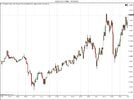
[/CENTER]As can be observed, the price tested lower from the open (1), it found more bids than offers and pushed higher towards the close. Now, as you can see, we could repeat the process for candles within this 1 minute chart as well, as they each tell a different story. So, one of the most important indicators are candlestick charts as they can inform you how the market has built up. Looking back at the 4-hour candlestick, we know the market has tested a lower price, found bids and pushed higher, so let’s take a look at the bigger picture.
We really see the context of this 4-hour candle here. We can observe a previous price rejection 4-hour candle after the price moved higher from its lows around 1.3100 level. We can see the price moved slightly higher from this but we can also see at the 1.3280 mark we have a series of long wicks suggesting that the market has also rejected these prices as well. So now we have a picture of what the orders are doing in the market.
Essentially we are saying we have a build-up of sellers above this level and a build-up of buyers below this level. As we have our picture, we can think of trading it and two options could be trade the range or trade the breakout. Trading the range is not an option simply because the size of the wick would require a relatively wide stop loss; if the price does move back into the range it would be a struggle to get 2 reward per 1 risk. This leaves a potential break out play.
Hopefully, this article has helped to explain the fundamental concept of how candlesticks work all the way through to trading the picture we now have of the market.
Attachments
Last edited: