Part I. Chart types

Commander in Pips: I think you will be happy now – today we turn to talking about chart types.
Pipruit: Finally! This is when the real practical stuff appears. I feel that I’m getting closer and closer to my first trade ever.
Commander in Pips: That’s right. Understanding of charting is a very important issue, especially, if you intend to deal with technical analysis.
Pipruit: Yes, exactly. I like the description of technical analysis that you’ve given in the previous chapter. Besides, charts look nice and it’s a pleasure (I suppose) to analyze them.
Commander in Pips: In general, you’re absolutely right. It is really interesting. So let’s start with them.
There are a lot of different types of charts that have an application in the real market. The most popular are:
1. Line chart
2. Bar chart
3. Candlestick chart
2. Bar chart
3. Candlestick chart

1. Line chart
This is the simplest chart type; it looks like a simple line. There is time on the X-axis and price on the Y-axis. This line links close price of each trading period – on the daily time frame, the trading period is single day, on a weekly chart it is one week. So, by linking together close prices for each trading period, we can see the price behavior during some period of time. Here is how it looks:
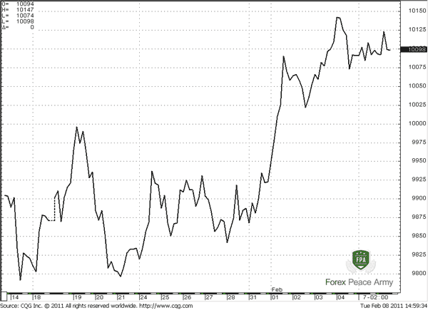
AUD/USD LINE CHART #1
This lack of information is filled by other two types of charts – bar charts and candlestick charts. These types of charts are mostly used for technical analysis.
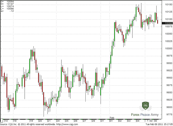
2. Bar chart
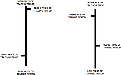
Besides just showing a close price for period like it was on line chart, bar chart also shows open price for trading period, as well as the high price and he low price. The assignment of X and Y axis are the same. The difference is only in appearance:
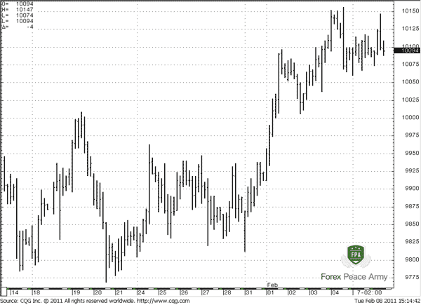
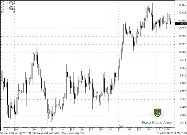
4-HOUR AUD/USD BAR CHART #2
First of all, you have to know the time-frame of particular chart that you are watching.
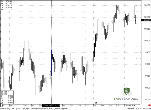
This is extremely important, because it tells you the duration time of each bar on the chart. As we said, our examples here are based on 4-hour chart of AUD/USD. The phrase “4-hour” means that each bar on the chart lasts for 4 hours. It does not mean that whole price action, that showed on the chart lasts 4-hours. Take a look at chart #3. See the cursor on particular bar? Now take a look at the table in low left corner of the chart. Here is information about particular bar – time/date when it has started, letters “O, H, L and C” stands for “Open, High, Low and Close” price of this particular bar (i.e. 4-hour period). Take a note that there is no information about ending time of this bar. Why? Because each bar here lasts for the same time period, since this is 4-hour chart, so our marked bar also has lasted 4 hours. And information about prices stands only for this particular period.
Again, you have to know the time-frame of particular chart that you are watching.
If we say “daily chart” it means that each bar on this chart lasts one day, although chart itself can include 150 days (i.e. bars). I think you’ve got the point.
#3 Each bar here lasts for 4-hours, because this is 4-hour chart of AUD/USD.
Here you can see information for particular bar that we’ve marked.
First of all, you have to know the time-frame of particular chart that you are watching.
Here you can see information for particular bar that we’ve marked.
First of all, you have to know the time-frame of particular chart that you are watching.
Now, let’s study what each bar on the chart means:
#4 Examples of bars

The small horizontal dash line from the left side of the bar shows opening price of that particular trading period. On the chart #3 “O” stands for “Open price”. It shows the price of the first trade that has happened on the market since starting of this period. For instance, let’s assume that this is 30-minute bar, and it starts at 15:00(ends at 15:30). Assume that first trade after 15:00 (since bar started) has happened at 15:00:17, so this is the open price of current bar. Take a note that this is not the quote that was on market at 15:00, this is the price at which the first real trade has happened in the 15:00-15:30 time period.The top point of any bar shows the highest price that took place in this particular period. In our example bar shows the highest price during the 30 minute period from 15:00 till 15:30. Also this is not the highest quote during this period – this is the highest price at which real trade has happened. On our chart#3 “H” stands for “High price”.
The low of any bar shows the lowest price that took place in this particular period. In our example bar shows the lowest price during the 30 minute period from 15:00 till 15:30. Also this is not the lowest quote during this period – this is the lowest price at which real trade has happened. On our chart#3 “L” stands for “Low price”.
And the last but not least is the close price. The small horizontal dash line from the right side of the bar shows close price of particular trading period. On our chart#3 “C” stands for “Close price”. It shows the price of the last trade that has happened on the market since starting of this period. Our 30-minute bar ends at 15:30. Assume that last trade before 15:30 has happened at 15:29:58, so this is the close price of current bar. And again, this is not the quote that was on market at 15:30, this is the price at which last real trade has happened in 15:00-15:30 time period.
Sometimes, you can meet bar charts without an open price, so there will be no dash from the left side. This is normal, because open price is rarely used in technical analysis as opposed to close price. Close price always will be on the chart, because it exceptionally important.
#4 Examples of bars

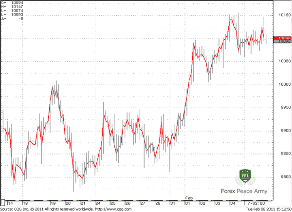
So, now you understand how to read bar charts and now I just want to show you the same bar chart, where I link all bars close prices with the line. Just compare this chart with the #1 linear chart, what do you see? Yes, the lines on both charts are the same:
So, now you understand how to read bar charts and now I just want to show you the same bar chart, where I link all bars close prices with the line. Just compare this chart with the #1 linear chart, what do you see? Yes, the lines on both charts are the same:
#5 Line, that links close prices of each bar is the same as a simple line chart:
Now, when you know about existing of high price for the period, and low price you should know that you also can build a line chart not only by close prices, but by any other as well. Most types of modern charting programs allow you to do that. So, you can draw a line chart by open prices, by highs or lows.Sometimes bar charts are called “OHLC” charts, or “HLC” (as we taked about possible absence of Open price).
Also, if you will meet word “BAR” later in our study, treat it as a single piece of data on the chart.
Now, take a look at Chart #4 and tell me, what is the difference between those two bars?
#4 Examples of bars
Pipruit: Well, on the first bar dash from the right side is higher then from the left, and on the second bar is vice versa…
Commander in Pips: Good, and what does that mean to us?
Pipruit: Since these dashes shows open and close price correspondingly, I think that during the first bar close price is higher than the open price, hence, during this period market shows some upward price action. On the second bar, conversely – there was a down move, because the bar closed at a lower price than it opened.
Commander in Pips: Excellent! And how we can determine the trading range of the particular period?
Pipruit: This is simple. Trading range is just a difference between high of the period and low of the period, i.e. particular bar. But let me ask something?
Commander in Pips: Sure, go ahead!
Pipruit: How we can determine the price range or open/close levels of some period that is not typical for our charting software. Say, the software does not allow us to build 3.5 day bars or 3 week bars, what we should to do in this case?
Commander in Pips: Can you guess by yourself? You need just drop your time frame and use lower time frame bars for this purpose. For example, you need the trading range of the 3.5 weeks. What does it mean? 3.5 weeks is equal to 17 days. Use the daily chart, so you can find the bar with lowest price with 17 days and with highest price within this 17 days. This will be the trading range that you want to determine. So, the same is with, say 17 hours range. Just drop to hourly chart and make the same observations. The most types of charting software currently allow us to build charts as low as a 1 minute chart, or even 1 tick chart.
Pipruit: And what is a tick chart?
Commander in Pips: A tick chart is a special type of chart. It has no time structure, so you can’t set it up to do hourly or daily. This chart just shows you each trade that takes place on the market and links the price of these trades by the line. As you understand, each trade happens at precise price, so there is cannot be any high, low, open and close. All of them are just a single price – the actual trade price. This is a very fast chart, especially on liquid markets, and it rarely used, especially for technical analysis.
Tick Chart Example
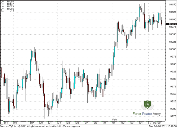
3. Candlestick chart
3. Candlestick chart
This kind of chart cares about absolutely the same information as z bar chart, but it looks a bit different. Just take a look at the chart #6, what can you tell about it?
#6 4-hour AUD/USD Candlestick chart
Pipruit: Hmm... it strongly reminds me the bar chart, as you’ve said. Two different colors stand, I think, for downward period (black candles) and to the upward period (white candles). I think that spikes from each candle show high and low. But how interpret these blocks…
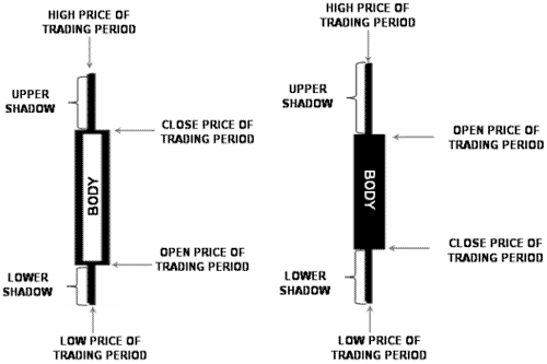
In general, candlestick charts are more graphic than bar charts and visual perception of them I easier than bar charts due to width of each candle (it is wider than a bar) and due to color.
#7 Red & Green 4-hour AUD/USD Candlestick chart
Pipruit: Cool! It’s much easier to understand, than a bar chart. #8 Custom-colored 4-hour AUD/USD Candlestick chart
Pipruit: Please stop – it’s making my eyes hurt.
Commander in Pips: Ok, just one thing, that I want to add about candlestick charts. They have some solid advantages:
1. They are easy to interpret, because they larger and different colors can help much with it. You just take a look at the chart and understand what is going on;
2. Candlestick patterns easier to see, because candles are bigger than bars.
2. Candlestick patterns easier to see, because candles are bigger than bars.
In spite of this, many professional traders prefer bars. In fact, this is a question of trading strategy and habits. It’s obvious that if your strategy involves candlestick patterns – you will use candlestick charts. Anyway, understanding of bars and candles is very desirable.
Comments

AsstModerator
12 years ago,
Registered user
I'll save a few questions by anticipating the most obvious ones.
Q. Is there really only 1 part in Chapter 7?
A. Yes.
Q. Why
A. Because that's how it was written. ;)
Q. Is there really only 1 part in Chapter 7?
A. Yes.
Q. Why
A. Because that's how it was written. ;)
P
Pierre le Roux
12 years ago,
Registered user
Chapter 7 chart types
Are there any advantages in using Hokan Ashi candles?
Are there any advantages in using Hokan Ashi candles?

Sive Morten
12 years ago,
Registered user
> Are there any advantages in using Hokan Ashi candles?
Hi Pierre,
There is an opinion that due the adjustment algorithm of Hokan Ashi candles, they allow you clearer see trends and reversal points. And mostly Hokan Ashi candles use on Commodity and Equity markets. But I think that there is no problem to use it on Forex.
Personally, I have not experimented with them and can't say deifinitely how great its advantage above standard candlesticks chart.
I have some suspicion that may be sometimes they allow to get some advantage, but this advantage is not so significant. This is almost like using Kagi and Renko charts. Do they have some advantage? May be. But also some disadvantages.
So as with Hokan Ashi candles. I think that this is just a bit another attempt to tune classic charts. You may try them, if they will be work for you - use it. Besides, it could be done very simple with MS Excell sheets, if you do not have software that shows this type of chart.
But then will appear another problem. IF you follow some strategy, say, Elliot wave or classical way of technical analysis ( I use DiNapoli approach) - anything. Here will be a question, how your trading style will work with Hakin Ashi charts, because these trading methods were based on standard charts...
A
Amanda_pips
12 years ago,
Registered user
Exist some advantage to use line chart against candlestick?
Sive Morten
12 years ago,
Registered user
> Exist some advantage to use line chart against candlestick?
Hi Amanda,
yes it does. Mostly when you try to estimate support/resistance levels. Since line charts are based on close price, it has less amount of spikes and fakes. So, using line chart makes identification of support/resistance zones simplier sometimes.
Hi Amanda,
yes it does. Mostly when you try to estimate support/resistance levels. Since line charts are based on close price, it has less amount of spikes and fakes. So, using line chart makes identification of support/resistance zones simplier sometimes.
T
think2
11 years ago,
Registered user
Just to remind you, that the last statement is written twice (so you can delete it):
Ok, just one thing, that I want to add about candlestick charts. They have some solid advantages:
1. They are easy to interpret, because they larger and different colors can help much with it. You just take a look at the chart and understand what is going on;
2. Candlestick patterns easier to see, because candles are bigger than bars.
In spite of this, many professional traders prefer bars. In fact, this is a question of trading strategy and habits. It’s obvious that if your strategy involves candlestick patterns – you will use candlestick charts. Anyway, understanding of bars and candles is very desirable.
AsstModerator
11 years ago,
Registered user
Regarding the conclusion being written twice, I've fixed it.
Regarding the conclusion being written twice, I've fixed it. :)
Regarding the conclusion being written twice, I've fixed it. :)
W
wendyyyy
7 years ago,
Registered user
what is the most popular charting software?

Pharaoh
7 years ago,
Registered user
For retail forex, it's currently MetaTrader.

Hamza Samiullah
7 years ago,
Registered user
amazing article..
Table of Contents
- Introduction
- FOREX - What is it ?
- Why FOREX?
- The structure of the FOREX market
- Trading sessions
- Where does the money come from in FOREX?
- Different types of market analysis
- Chart types
- Support and Resistance
- Candlesticks – what are they?
- Mysterious Fibonacci
- Introduction to Moving Averages
- Bollinger Bands
- Leading and Lagging Indicators
- Basic chart patterns
- Pivot points – description and calculation
- Elliot Wave Theory
- Intro to Harmonic Patterns
- Divergence Intro
- Harmonic Approach to Recognizing a Trend Day
- Intro to Breakouts and Fakeouts
- Again about Fundamental Analysis
- Cross Pair – What the Beast is That?
- Multiple Time Frame Intro
- Market Sentiment and COT report
- Dealing with the News
- Let's Start with Carry
- Let’s Meet with Dollar Index
- Intermarket Analysis - Commodities
- Trading Plan Framework – Common Thoughts
- A Bit More About Personality
- Mechanical Trading System Intro
- Tracking Your Performance
- Risk Management Framework
- A Bit More About Leverage
- Why Do We Need Stop-Loss Orders?
- Scaling of Position
- Intramarket Correlations
- Some Talk About Brokers
- Forex Scam - Money Managers
- Graduation!